Back to home
Internal design systemFree source file

A system designedto scale with teams.

A production-ready architecture for accessible enterprise products, connecting semantic variables, reusable components, and responsive patterns across iOS, Android, iPad, and desktop web.

Design Systems cover showing typography, icons, colors, motion, layout, tokens, and variables

Internal Design System · source-of-truth Figma library

49 pages · 2,738 components · 2,010 variables

Version

v1.0

Owner

Vamshi Vanaparthi

Platforms

iOS · Android · iPad · Web

Responsive modes

320px · 672px · Wide · Narrow

Accessibility

WCAG 2.2 AA

System inventory

Built as infrastructure, not a sticker sheet.

The file brings foundations, components, and responsive behavior into one governed system, ready for designers to compose and engineers to map into production.

01

Foundational tokens

A semantic foundation that separates intent from raw values, allowing product teams to update themes without rebuilding components.

  • 95 color values
  • Typography scales
  • 7 spacing variables
  • Elevation and surface roles

2,010 variables
02

Core component library

Reusable, variant-driven patterns for everyday workflows, from simple controls to complex enterprise data interactions.

  • Buttons and inputs
  • Dropdowns and navigation
  • Cards and modal states
  • Tables, calendars and date fields

2,738 components

03

Layout adapters

Breakpoint and grid-mode logic that preserves hierarchy, density, and usability as an experience moves between device classes.

  • Mobile touch patterns
  • Tablet split views
  • Desktop density
  • Wide and narrow modes

4 platform contexts

Architecture

From raw values to semantic intent.

Tokens separate color values from usage so a single palette can serve light and dark surfaces without duplicating components. Roles describe what a color means, not what it is.

Semantic roles: light theme

text / primary

#1D2021

text / secondary

#434B4F

link / inverse

#78A9FF

button / primary

#0F62FE

button / secondary · hover

#F5F9FB

overlay / background

#FFFFFF

Semantic roles: dark theme

text / primary

Foundation · text · strong

surface / canvas

Foundation · surface · base

button / secondary

Action · secondary · default

link / inverse

Action · link · inverse

Review request

Ready for approval

Active
CancelApprove

Color foundations

Every color value, straight from the source file.

The Colors collection holds 95 published values across neutral and expressive families. Each step carries a documented hover pair where interaction requires one, so states never get improvised.

Gray

Neutral surfaces, text, borders

  • Gray 10#F4F4F4#E8E8E8
  • Gray 20#E0E0E0#D1D1D1
  • Gray 30#C6C6C6
  • Gray 40#A8A8A8
  • Gray 50#8D8D8D
  • Gray 60#6F6F6F#5E5E5E
  • Gray 70#525252#636363
  • Gray 80#393939#474747
  • Gray 90#262626
  • Gray 100#161616

Cool Gray

Secondary neutral theme

  • Cool Gray 10#F2F4F8
  • Cool Gray 20#DDE1E6#CDD3DA
  • Cool Gray 50#878D96
  • Cool Gray 70#4D5358#5D646A
  • Cool Gray 100#121619

Warm Gray

Alternate neutral theme

  • Warm Gray 20#E5E0DF#D8D0CF
  • Warm Gray 70#565151#696363
  • Warm Gray 100#171414

Blue

Primary action, links, focus

  • Blue 10#EDF5FF
  • Blue 20#D0E2FF#B8D3FF
  • Blue 30#A6C8FF
  • Blue 40#78A9FF
  • Blue 50#4589FF
  • Blue 60#0F62FE#0050E6
  • Blue 70#0043CE#0053FF
  • Blue 80#002D9C

Cyan

Informational states

  • Cyan 10#E5F6FF
  • Cyan 20#BAE6FF#99DAFF
  • Cyan 30#82CFFF
  • Cyan 40#33B1FF
  • Cyan 50#1192E8
  • Cyan 70#00539A#0066BD

Teal

Supporting accent

  • Teal 10#D9FBFB
  • Teal 20#9EF0F0#57E5E5
  • Teal 50#009D9A
  • Teal 70#005D5D#007070

Green

Success and positive status

  • Green 10#DEFBE6
  • Green 20#A7F0BA#74E792
  • Green 60#198038
  • Green 70#0E6027#11742F

Yellow

Caution and low-severity alerts

  • Yellow 20#FDDC69#FCCD27
  • Yellow 70#684E00#806000

Orange

Warning states

  • Orange 20#FFD9BE#FFC69E
  • Orange 70#8A3800#A84400

Red

Error, destructive, danger

  • Red 10#FFF1F1
  • Red 20#FFD7D9#FFC2C5
  • Red 40#FF8389
  • Red 50#FA4D56
  • Red 60#DA1E28#B81922
  • Red 70#A2191F#C21E25
  • Red 80#750E13

Magenta

Data visualization accent

  • Magenta 10#FFF0F7
  • Magenta 20#FFD6E8#FFBDDA
  • Magenta 40#FF7EB6
  • Magenta 50#EE5396
  • Magenta 70#9F1853#BF1D63

Purple

AI and intelligence surfaces

  • Purple 10#F6F2FF
  • Purple 20#E8DAFF#DCC7FF
  • Purple 30#D4BBFF
  • Purple 40#BE95FF
  • Purple 50#A56EFF
  • Purple 60#8A3FFC
  • Purple 70#6929C4#7C3DD6

Neutral

Absolute values and overlays

  • Neutral White#FFFFFF
  • Neutral Black#000000

Semantic roles

How the palette is consumed by components.

  • text / primary#1D2021
  • text / secondary#434B4F
  • link / inverse#78A9FF
  • button / primary#0F62FE
  • button / secondary · hover#F5F9FB
  • overlay / background#FFFFFF

65 values shown · Colors collection · single “Value” mode

Cross-platform system

One language, adapted to every screen.

Shared foundations stay recognizable while layout, density, navigation, and interaction patterns respond to each platform’s conventions.

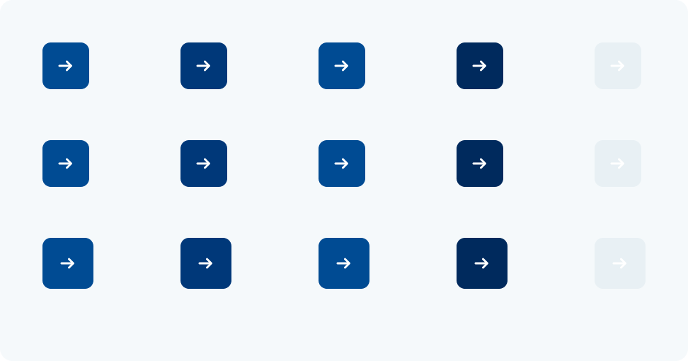
Primary actions example from the attached design-system source file

Actions · interaction states

Primary actions

Primary icon buttons documented across default, hover, pressed, focused, and disabled states.

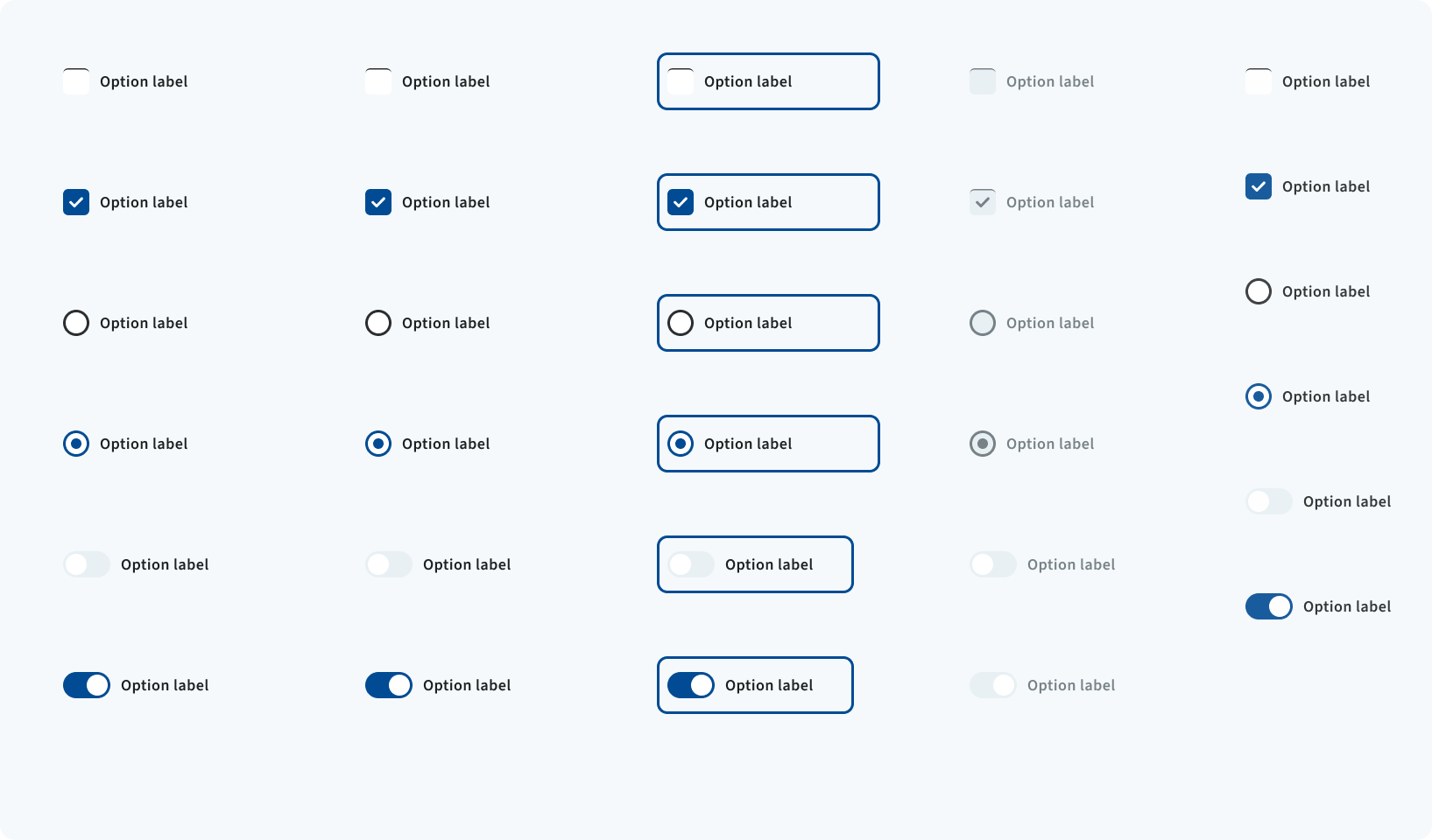
Selection controls example from the attached design-system source file

Controls · complete state matrix

Selection controls

Checkboxes, radio buttons, and switches shown across selection, focus, disabled, and compact variants.

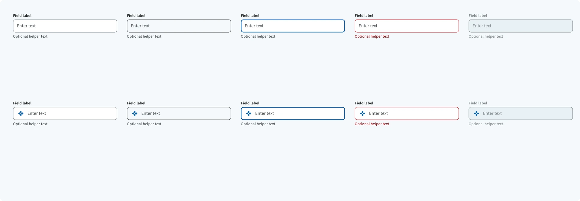
Text inputs example from the attached design-system source file

Fields · validation states

Text inputs

Text fields with optional leading icons across default, hover, focus, error, and disabled states.

Complete source file · Free

Inspect the architecture. Make it your own.

Download the complete Figma library to explore its variables, components, responsive patterns, and documentation. Need help adapting it to your brand or product? Let’s work together.